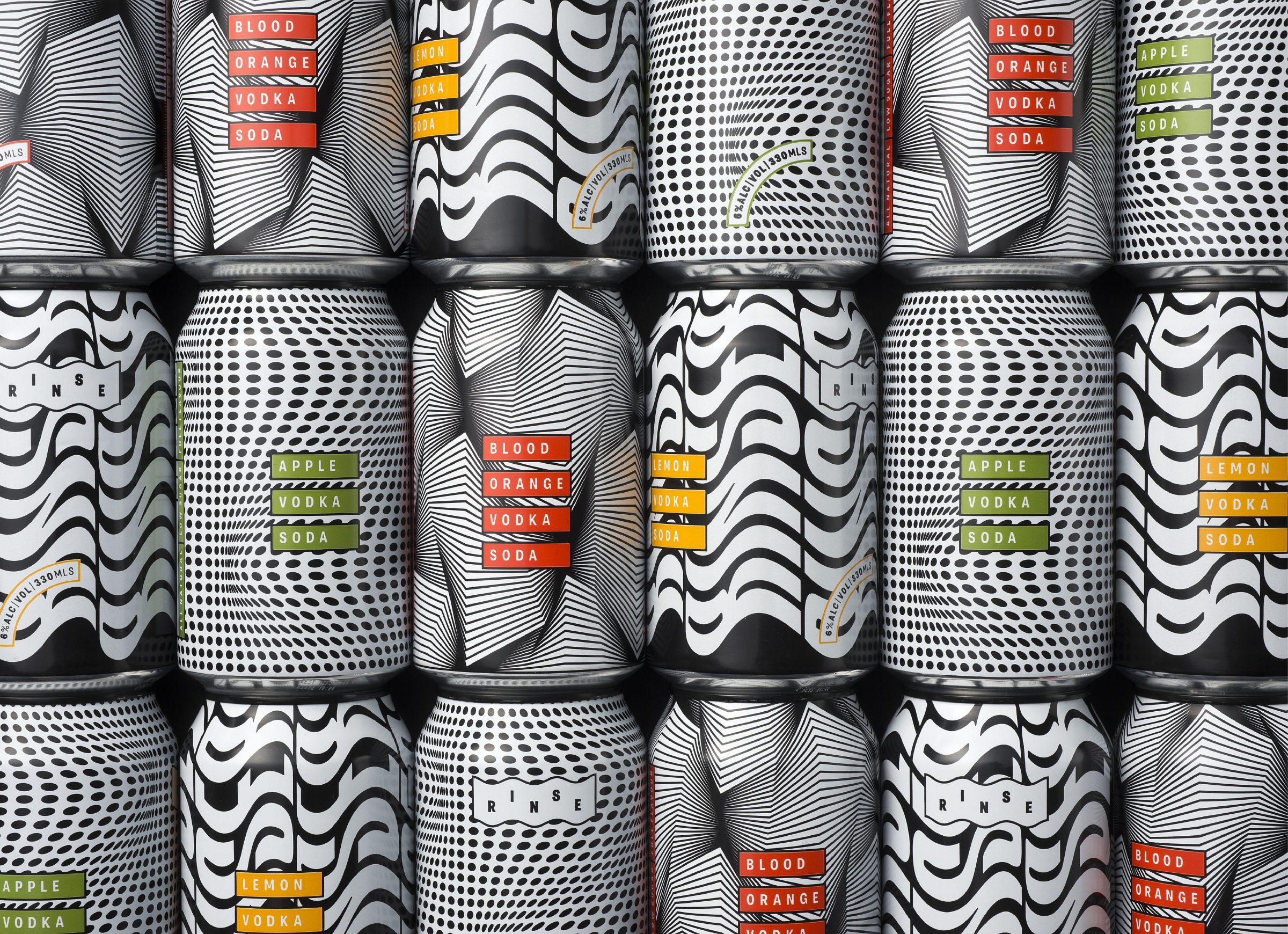
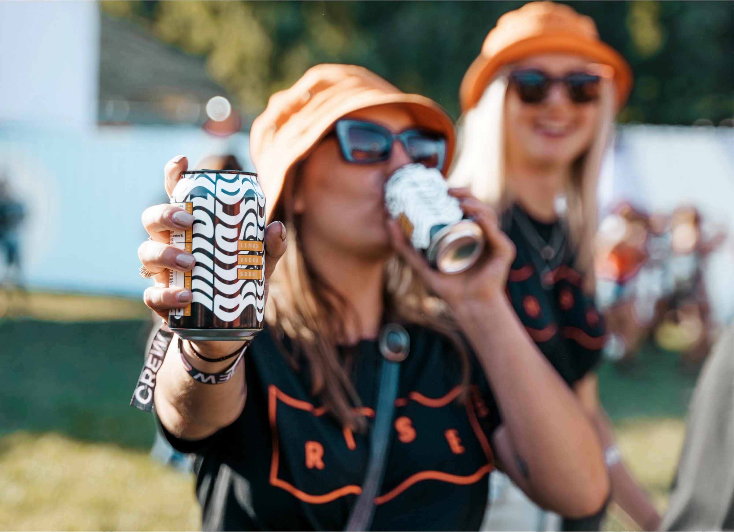
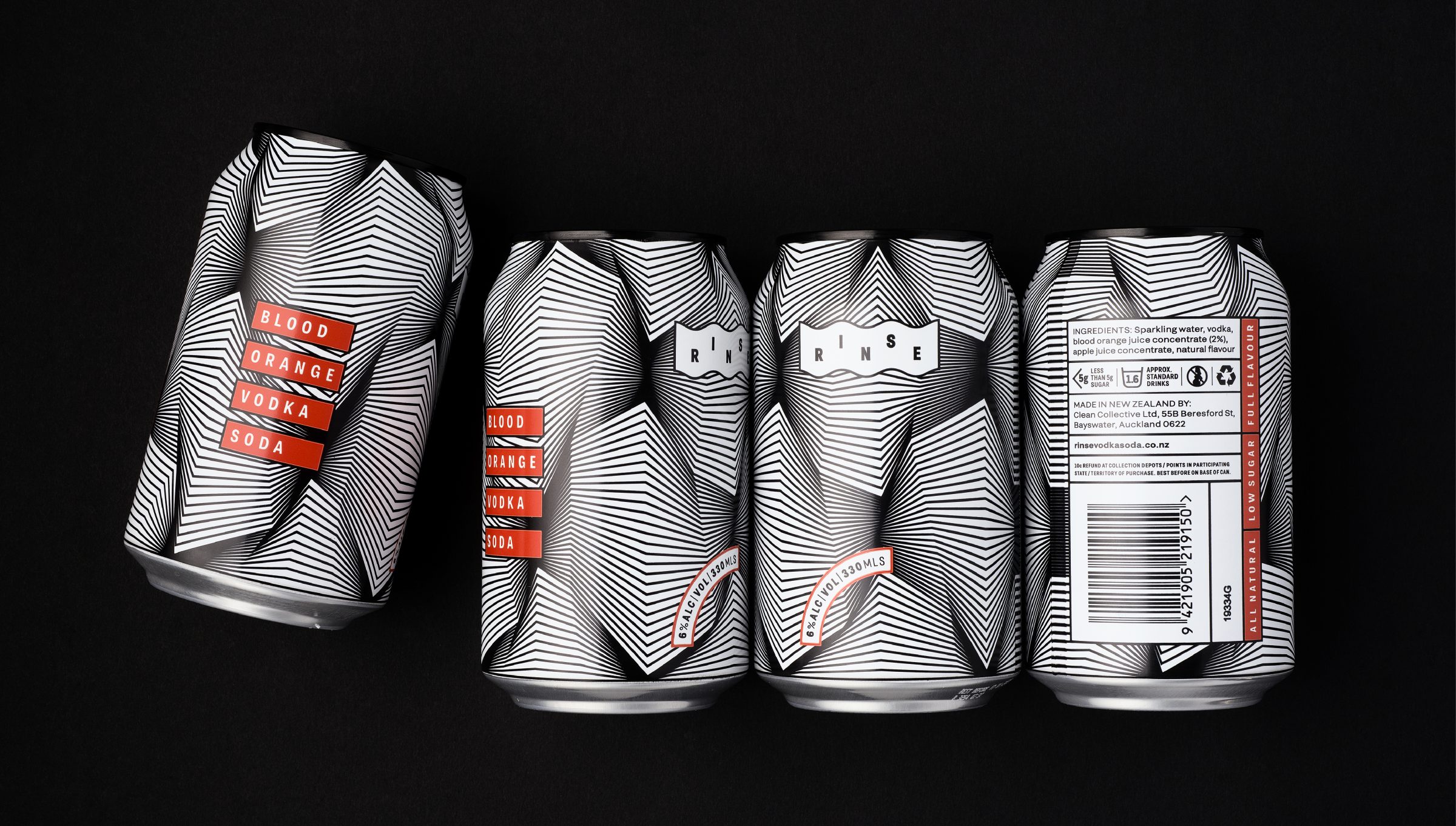
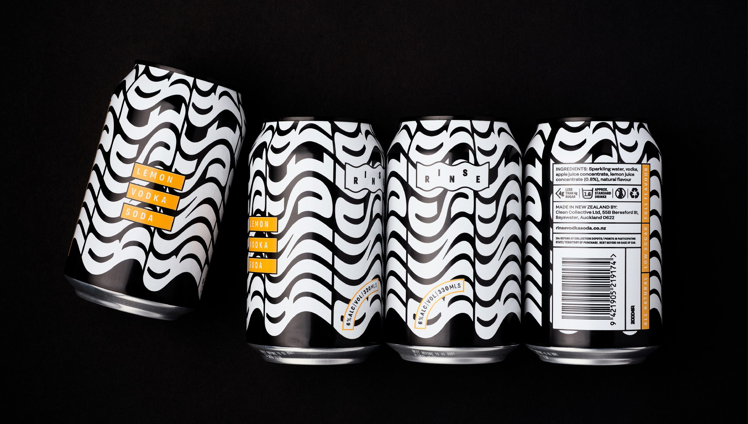
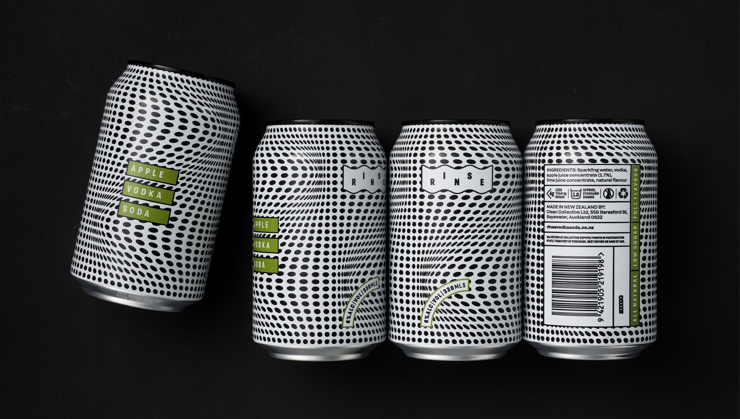
2019 was the year of the healthy / low-calorie RTD in a can. Competition was fierce, but almost exclusively targeting women. Think pinks and gradients and serif type. The RINSE team saw a gap in the market. They wanted to create a vodka soda with refined flavours, made with clean and simple, all-natural ingredients and no fake stuff. A can that young ‘FOMO Yo-Pro’ (young professional) men would be proud to be seen drinking with their mates on the “rinse”.
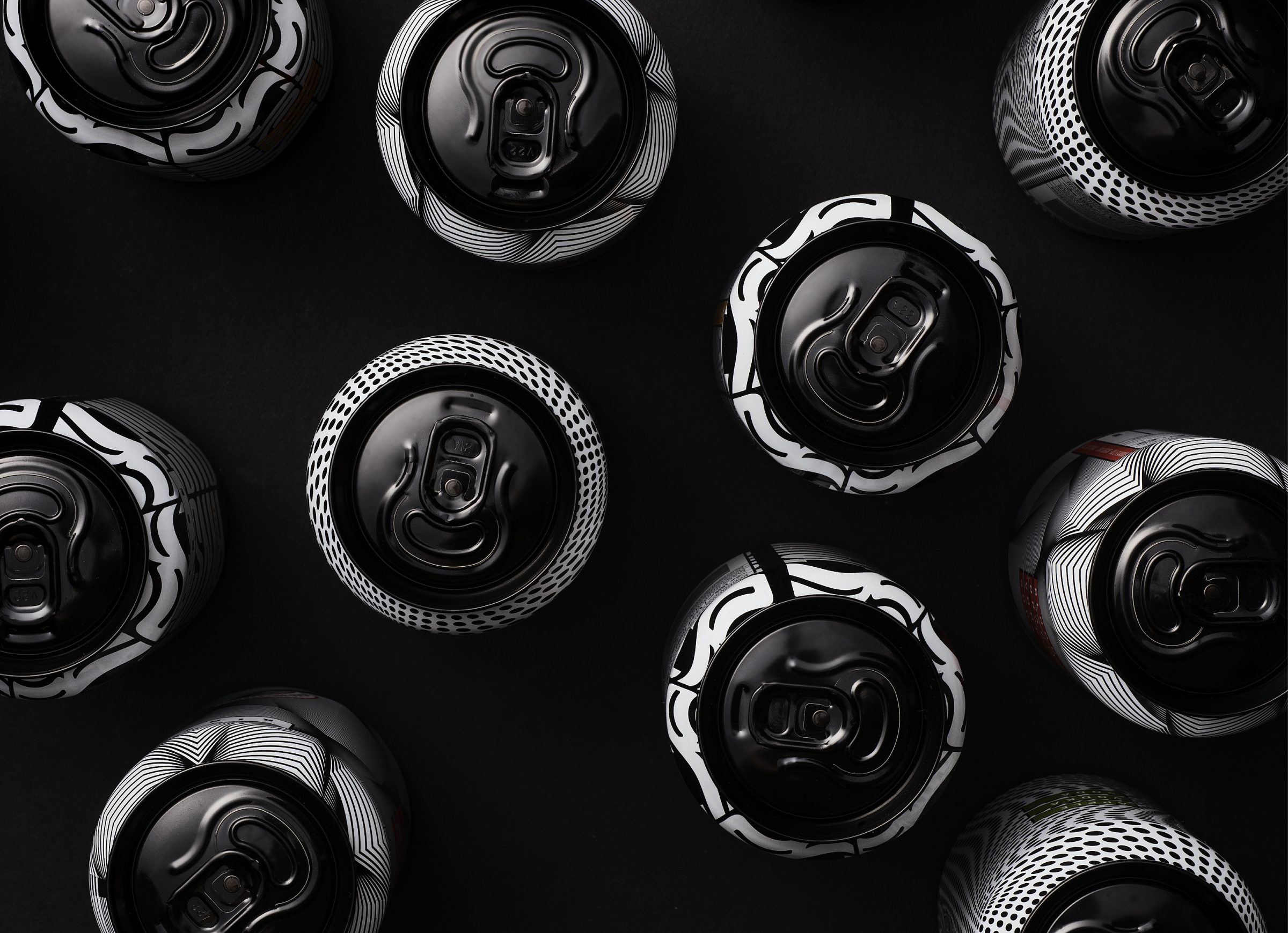
The concept: We don’t do average. Or polite. Or same-same. RINSE is the vodka soda that looks cool in your hands. Cool in your fridge. Cool on the shop shelves. That guy you know had a box last week at that party, and now you need it. We get it. The colour palette plays with traditional cues of vodka (white and black) but flips it on its head with bold, sports-luxe inspired graphics. Each variant has its own signature look, intentionally playing with form, slightly distorting reality.
