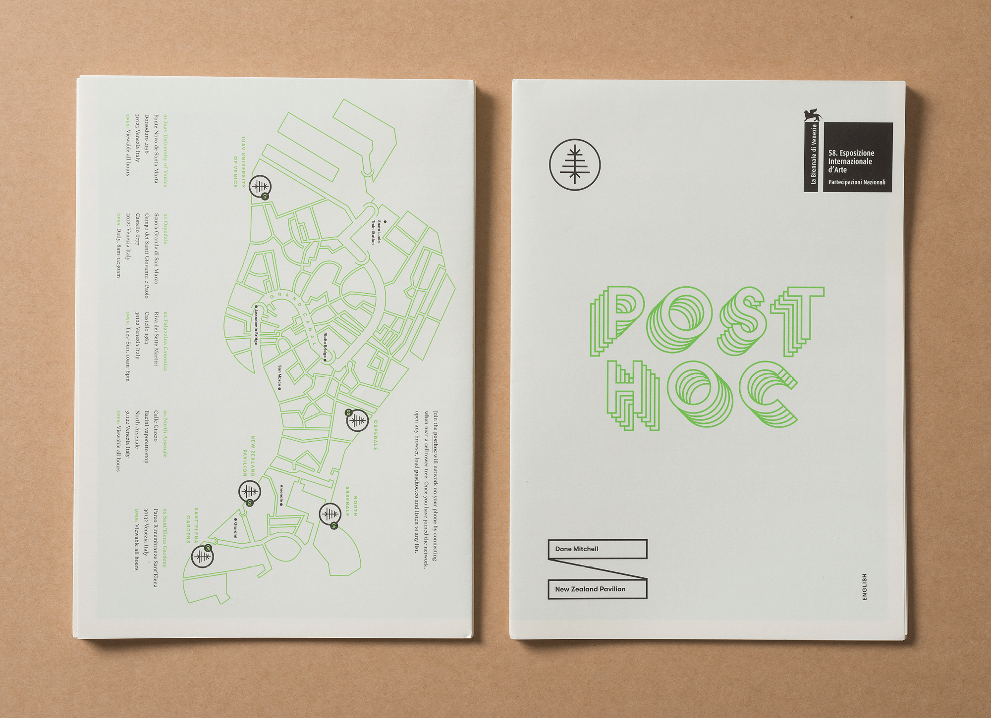
POST HOC
Post hoc by Dane Mitchell was presented by Creative New Zealand at The Venice Biennale 2019.
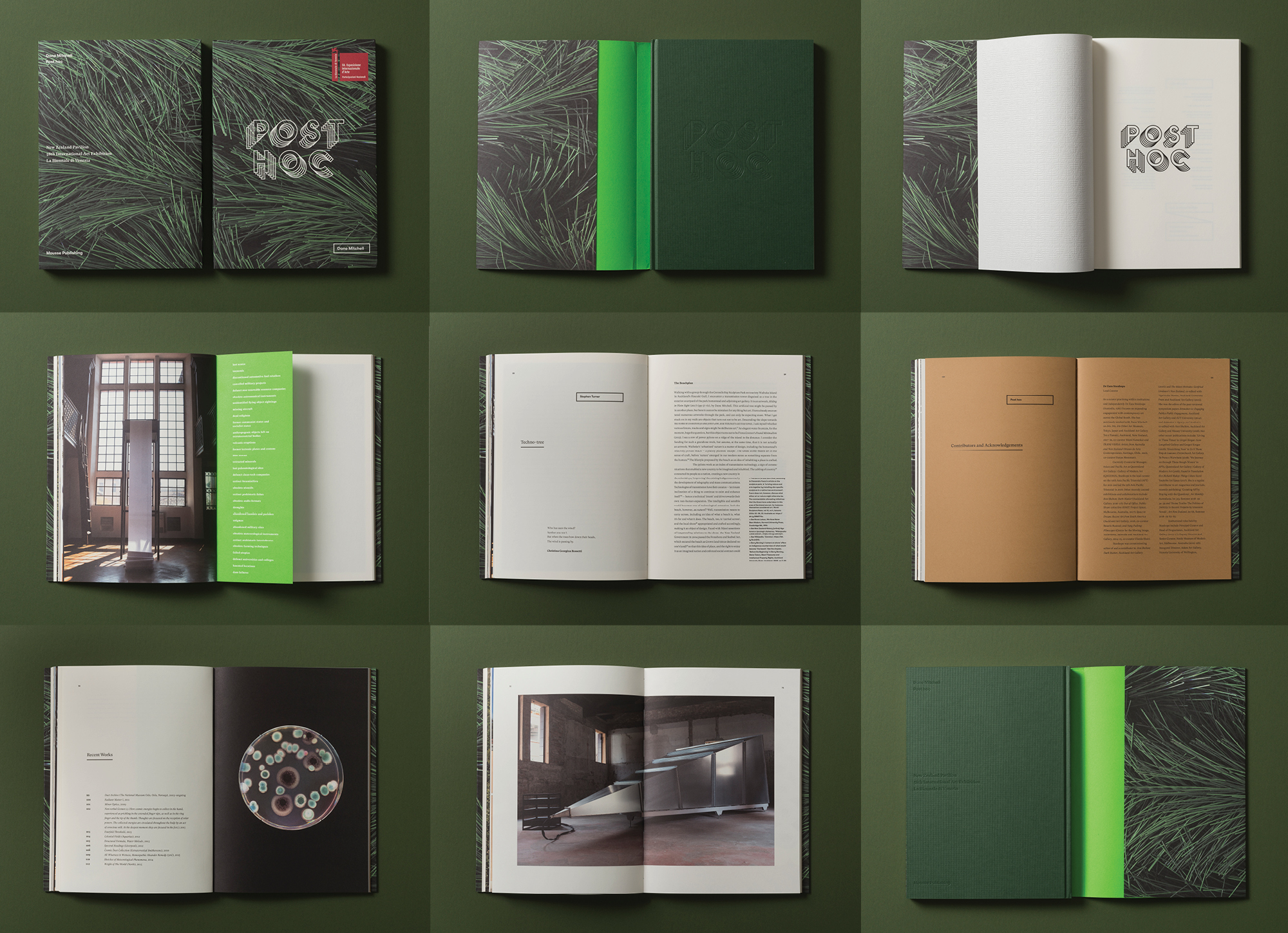
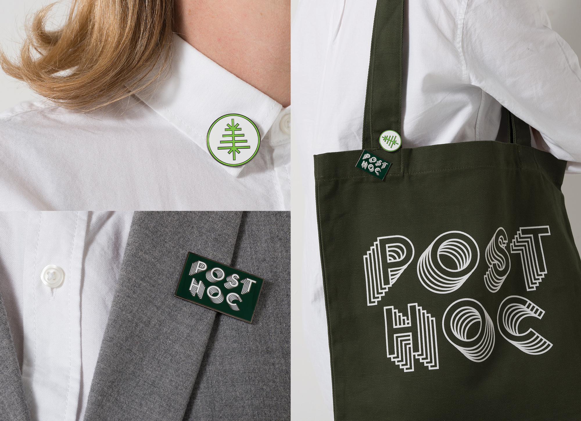
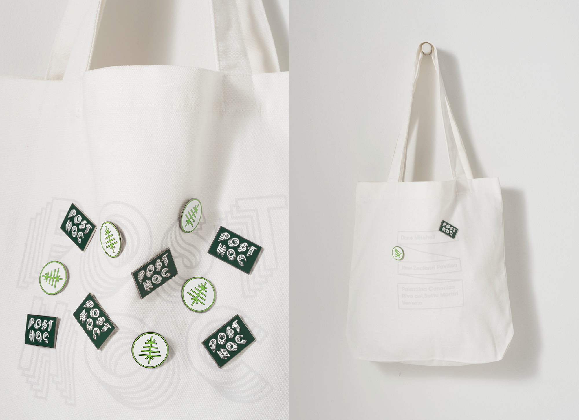
For Post Hoc we created a brand that balances the aesthetically confronting & the poetic. Representing a complex, multi-layered & intricately faceted project in a simple, accessible & iconic way to draw in the general public whilst retaining enough intrigue & nuance to gain the respect of the cultural elite.
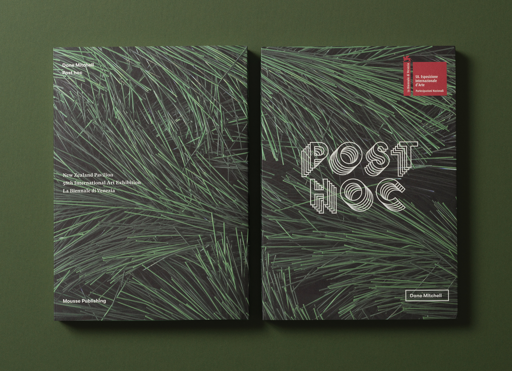
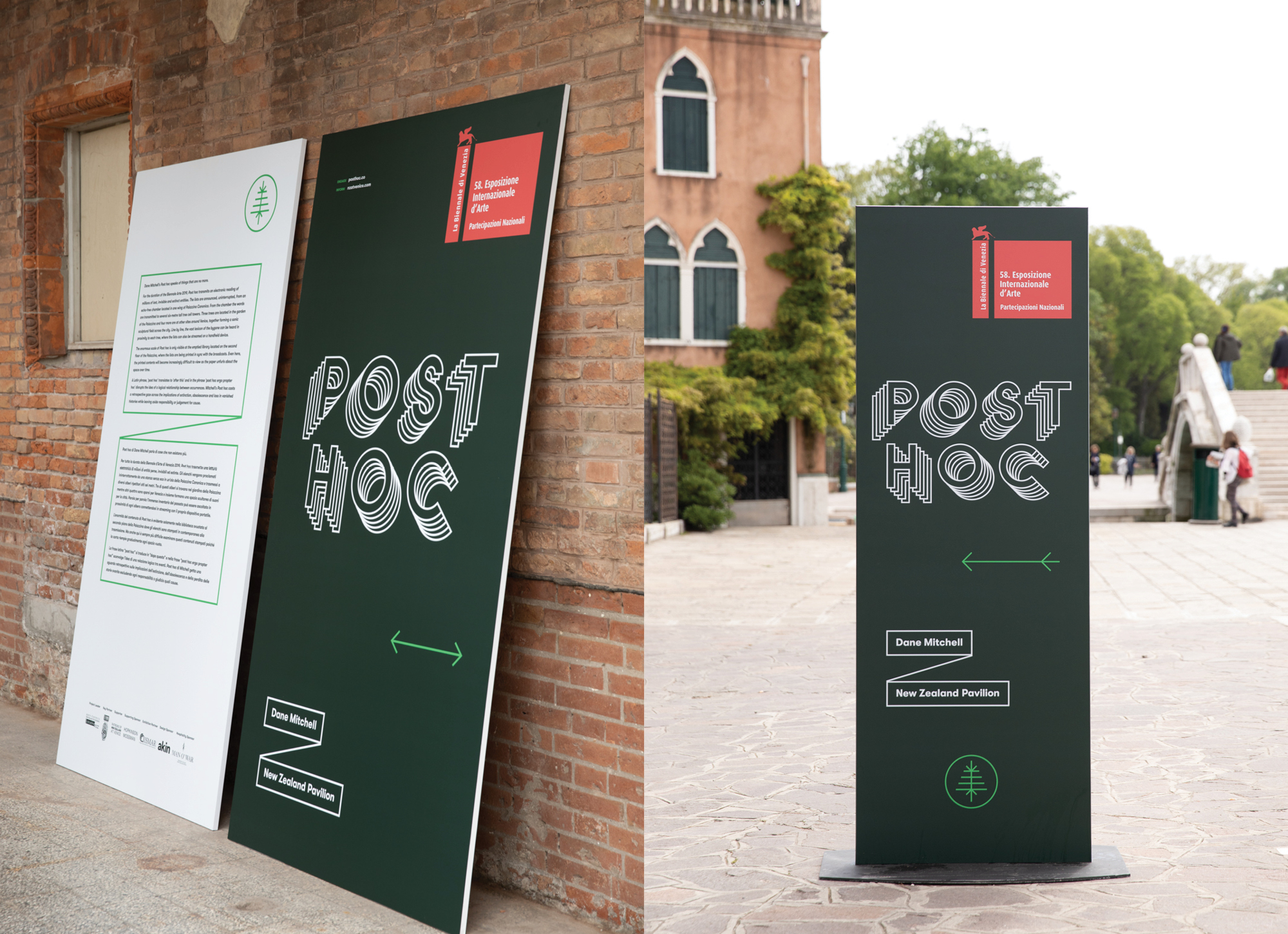
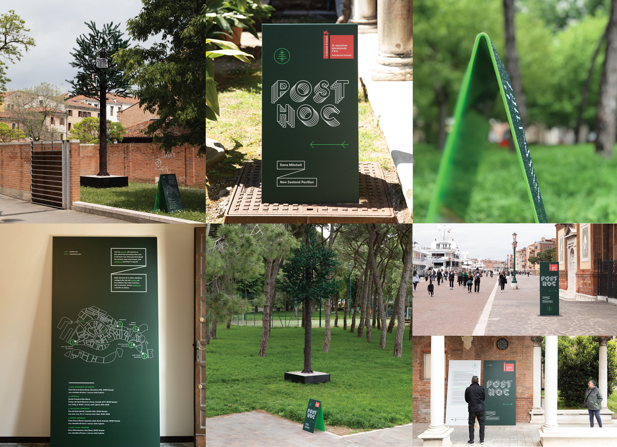
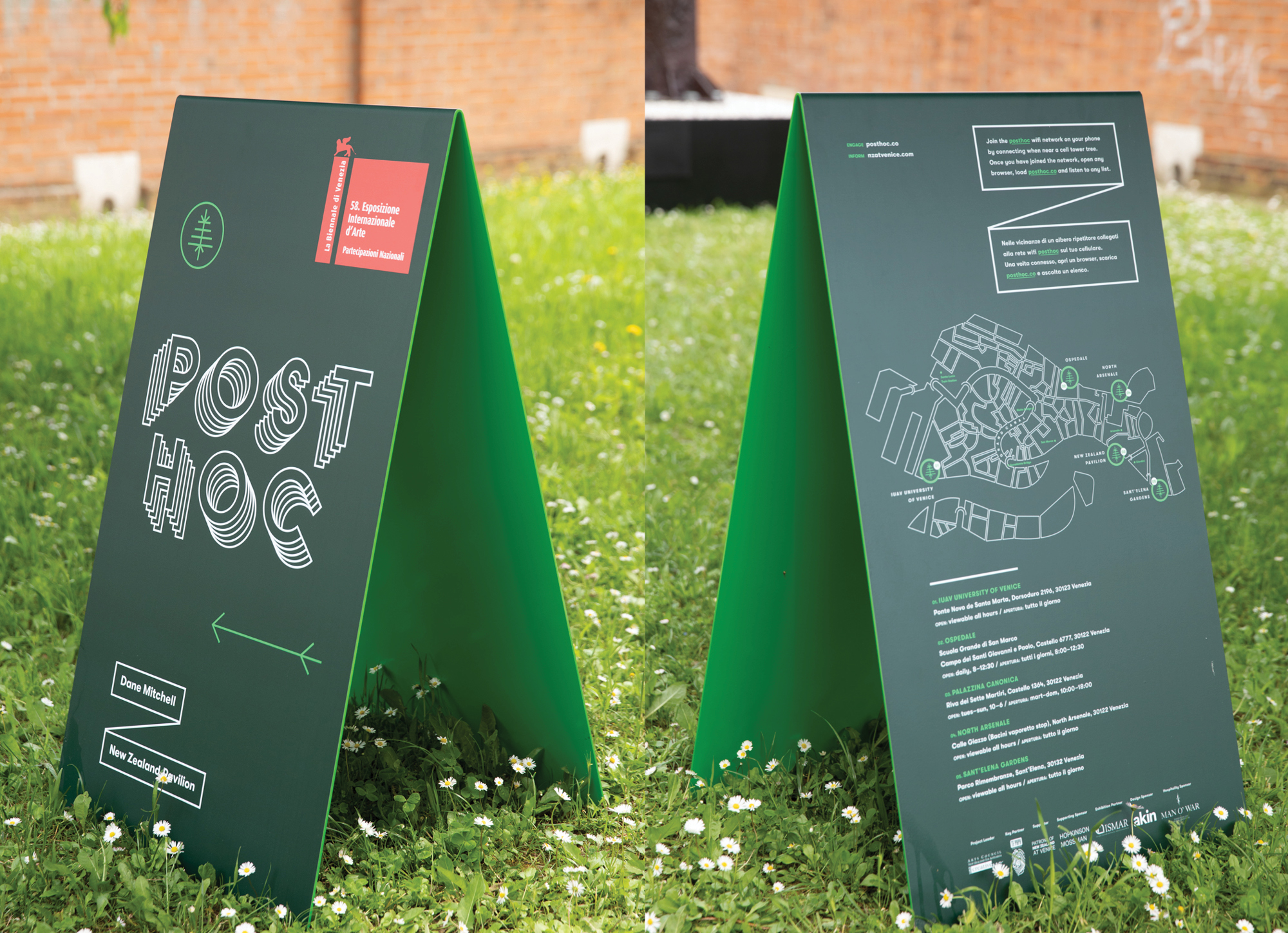
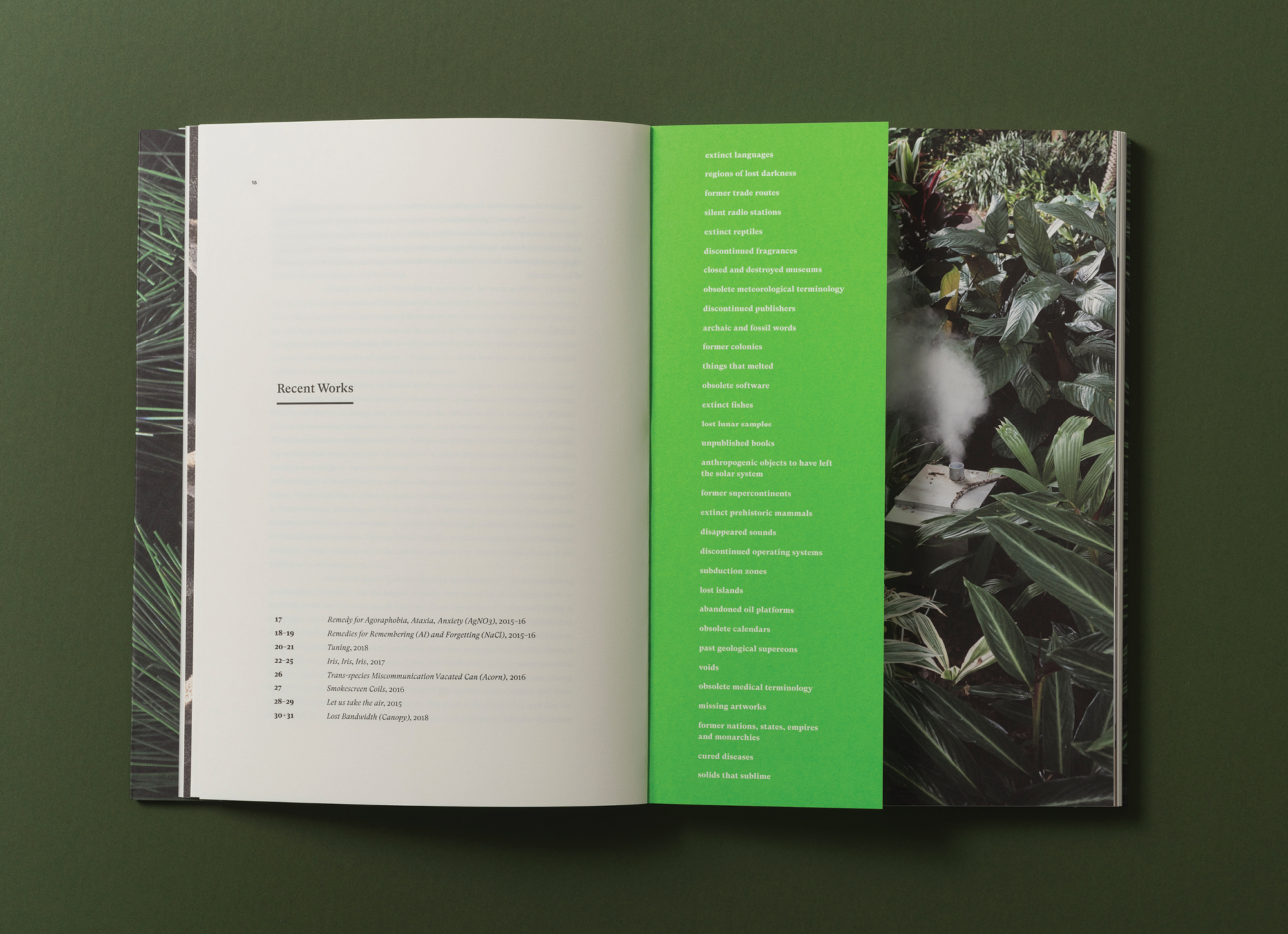
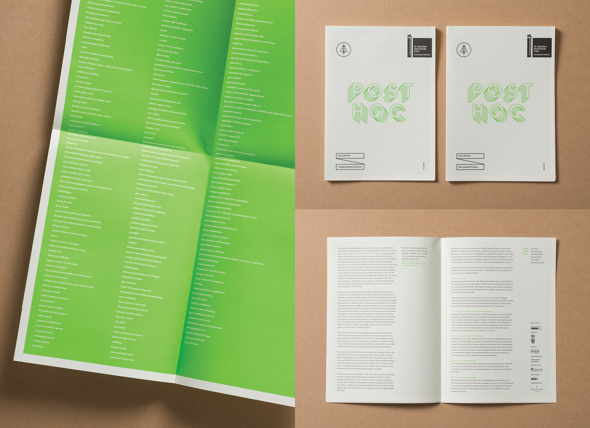
Dane Mitchell’s Post hoc consists of a vast inventory of bygone, disappeared, lost & extinct things broadcasted from the New Zealand Pavilion to multiple locations across Venice via industrially produced, aesthetically awkward, tree cell towers. The countless inventory of things-no-more are also simultaneously printed out — filling the vast, emptied library of a venetian palazzo over the course of the six month exhibition.
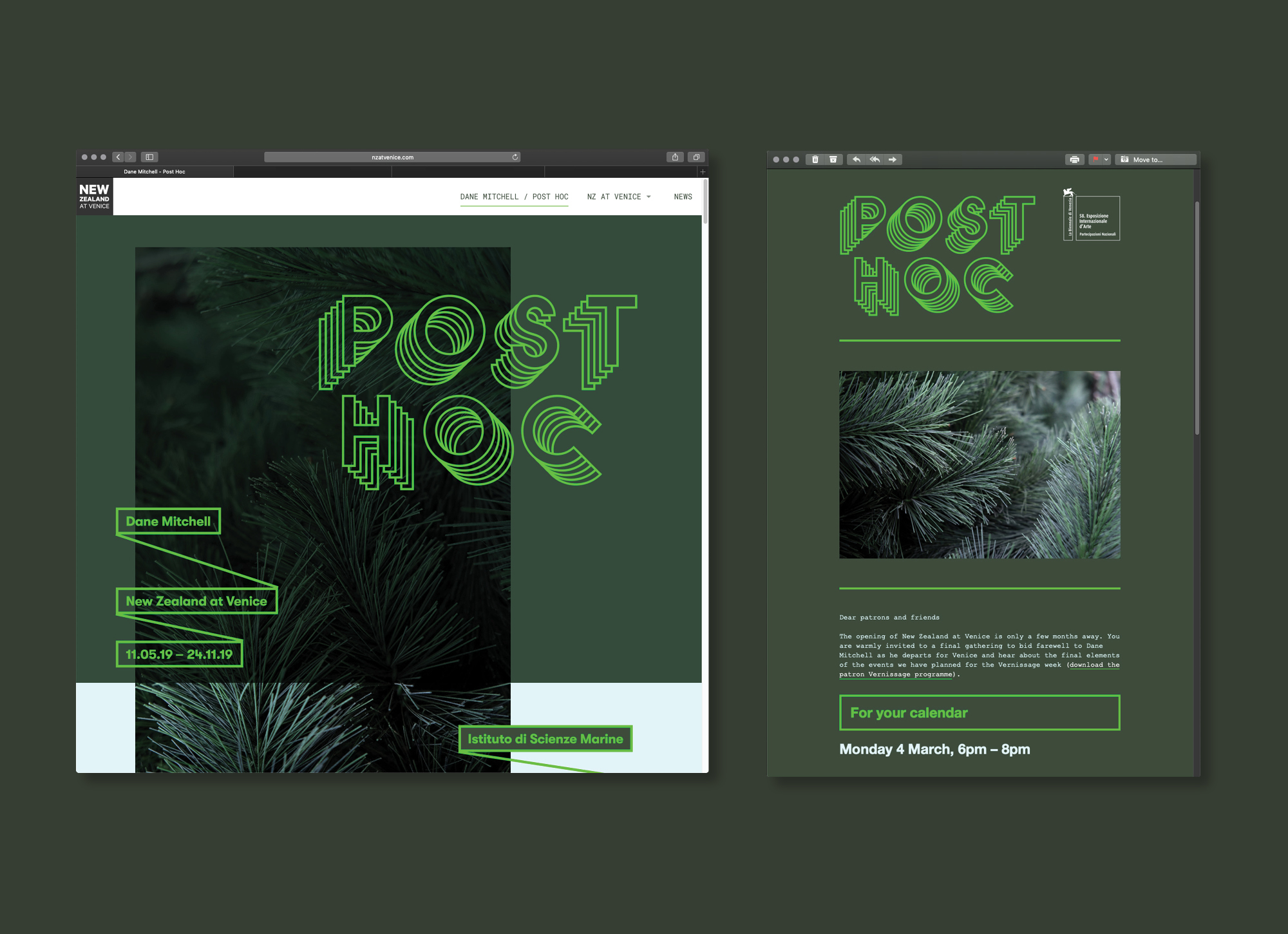
This jarring combination of venetian patina, poetic loss & pretend trees is captured through the combining of earthy tones & materials with an acidic nuclear green. The awkward form of the fake tree is simplified into an icon that links the multi-faceted experience together across Venice. Broadcast is evoked through the repeating line work in the word mark, which is activated digitally as an animated gif. Concepts of the visible & invisible are referenced throughout the experience through tone-on-tone material finishes.
The act of listing & inventory is referenced typographically throughout, with the list-of-lists running throughout the publication {as well as being presented as a poster on the brochure’s verso}, in the way the footnotes dominate the text & via the stylistic nod to philosopher Baudrillard’s list-making device of box & line .