Tuckshop Matakana
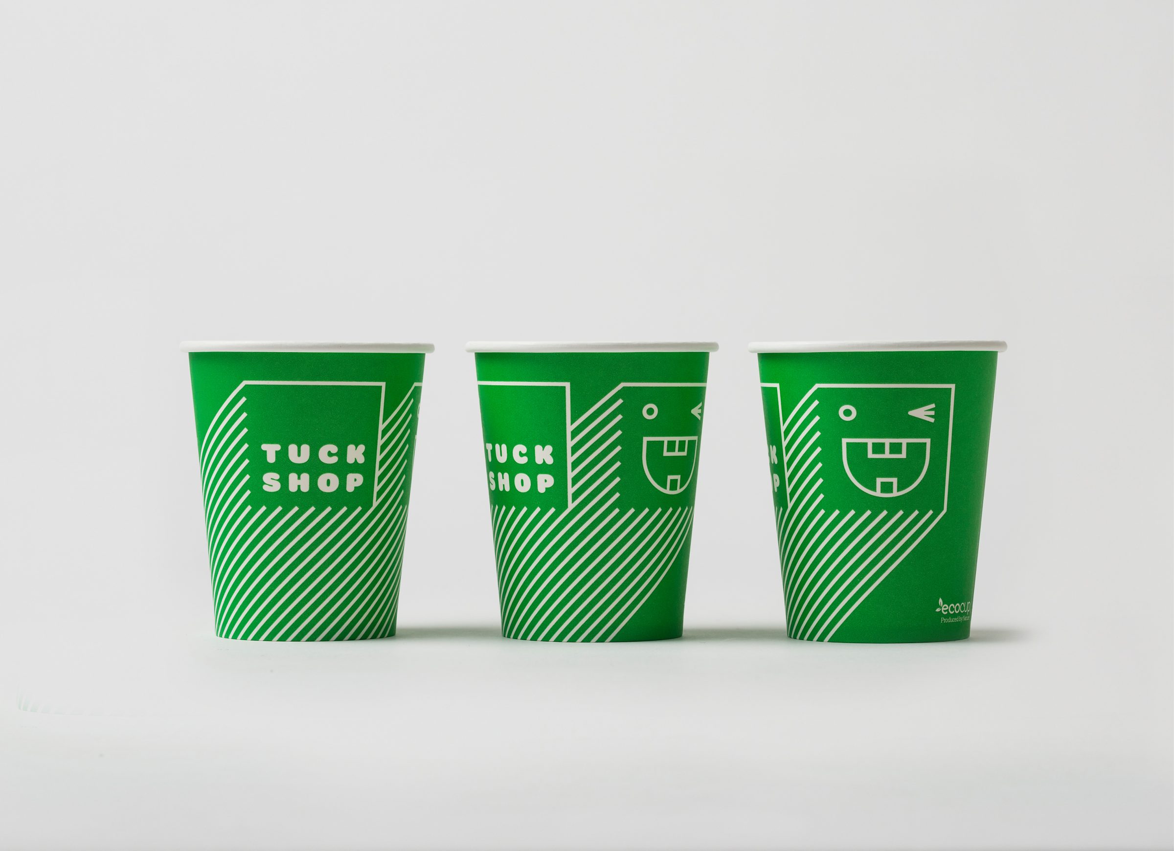
A cafe with a small budget and a big eco-green heart was opening in Matakana, a tight-knit community of loyal locals and bustling weekend market-goers. The sustainability-minded owners were clear on their aim: healthy, seasonal food & great coffee served thoughtfully {all packaging needed to be fully compostable, all practices eco-friendly} in a relaxed spot on the main street.
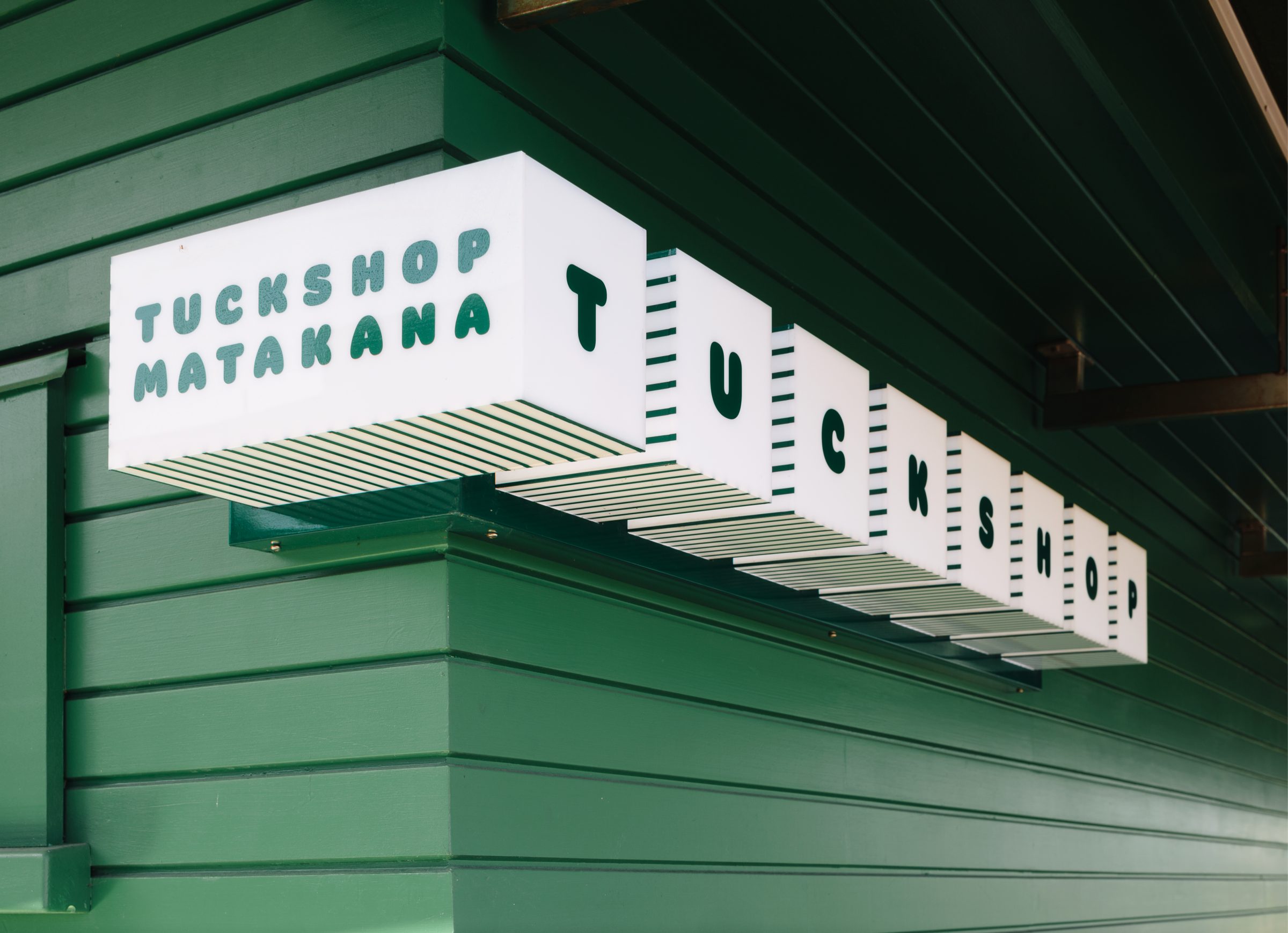
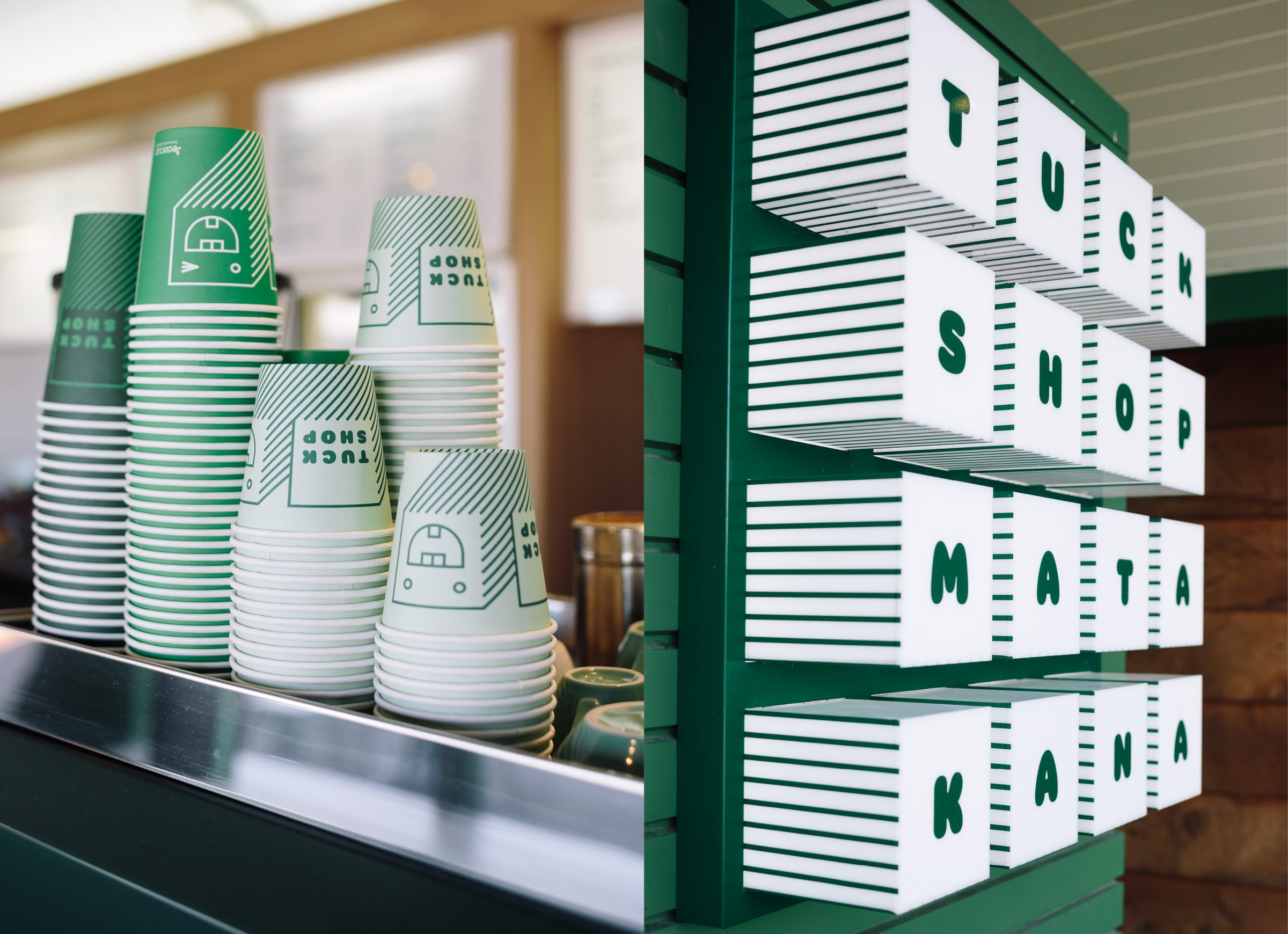
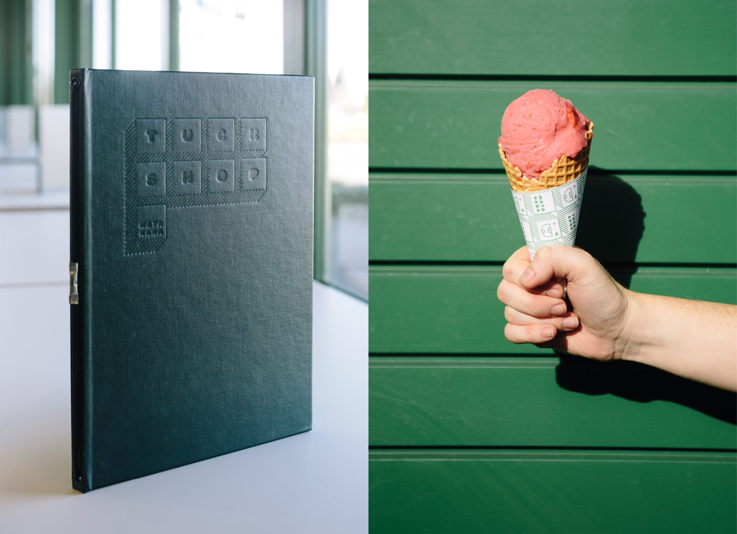
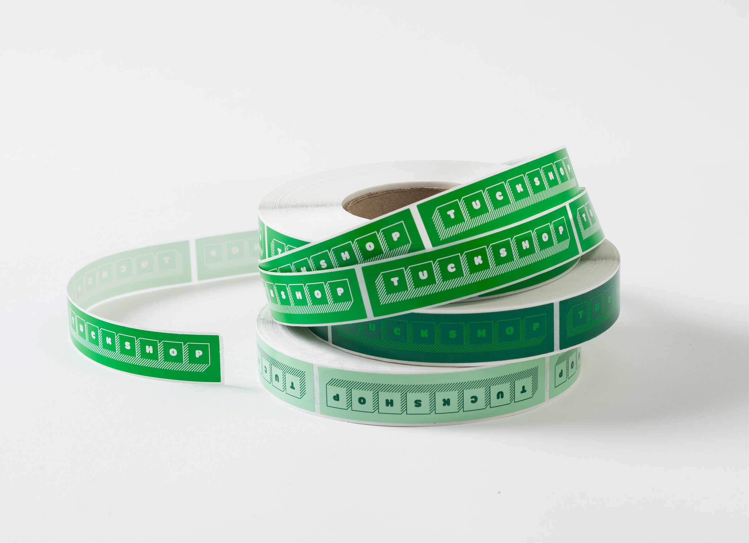
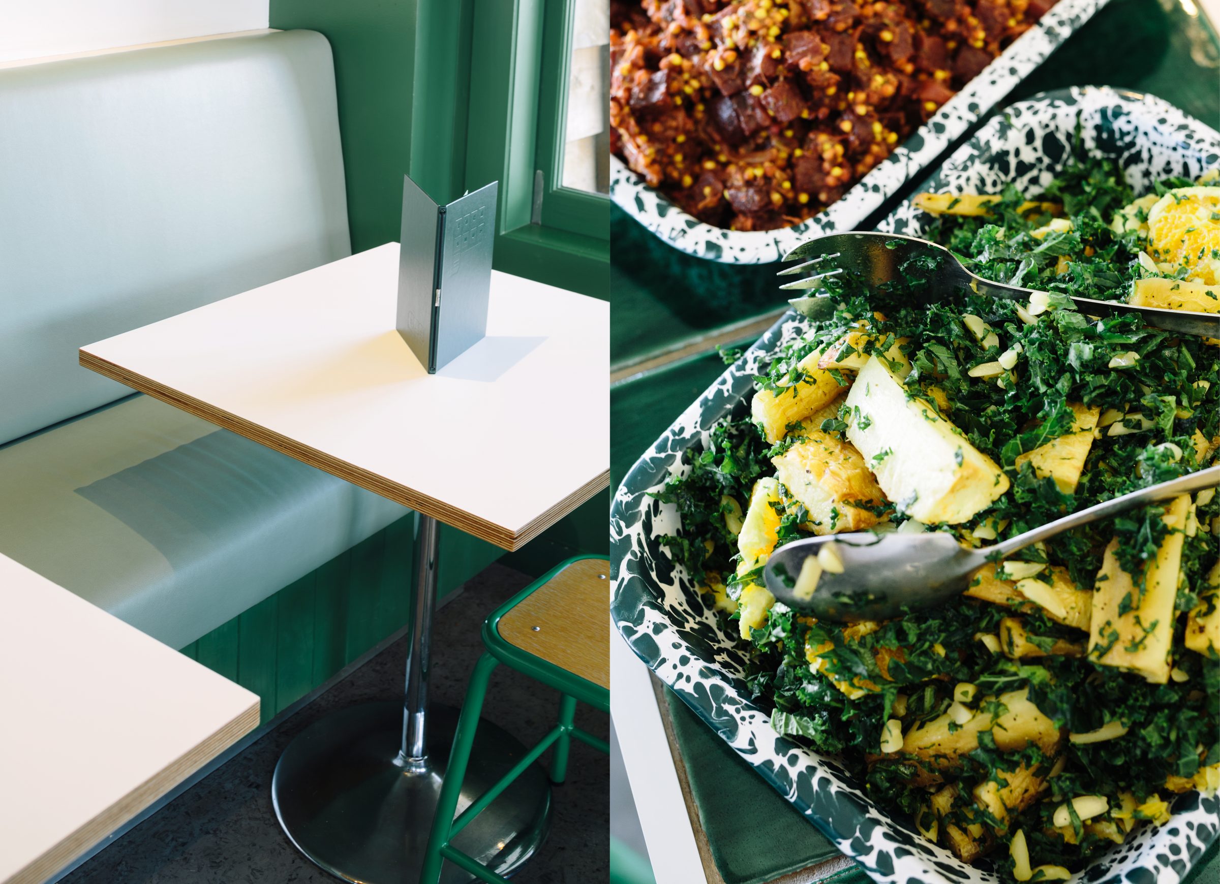
Knowing these guys were super serious about being eco, we responded tongue-in-cheek to the oft-mentioned catch-cry of ‘greenwashing’. Not satisfied with just one shade of green, we used as many as we could throughout the brand and environment. One might not find a more green {inside & out} as this one.
Nods to the classic ‘tuck shop’ converged with an easy-going tone-of-voice {no preaching} and a happy little guy who became our mascot. We created a simple and single-minded typographic system, based on old modular signage systems, in reference to tuck shops past and the cinema site the cafe is based on.
