

B&F Papers Swatch Books
Looking around, it seemed the industry standard for paper swatch books included terrible stock photos (hurting designer’s eyes on the daily) on a tiny piece of paper partnered with a lack of relevant information. Which all made it nigh impossible to make an informed decision quickly without calling the rep.
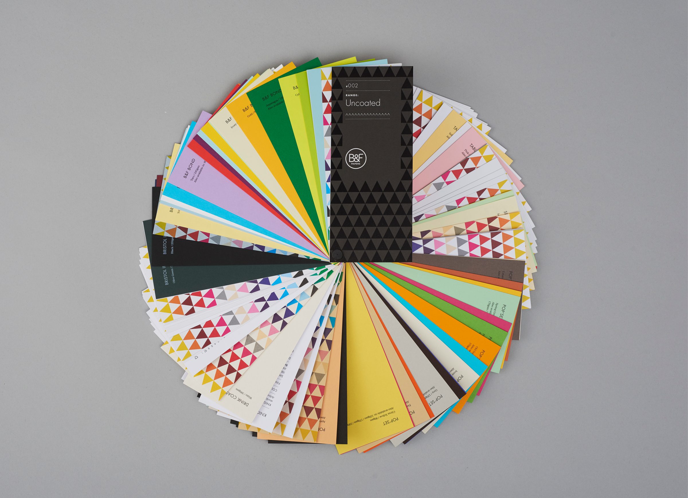
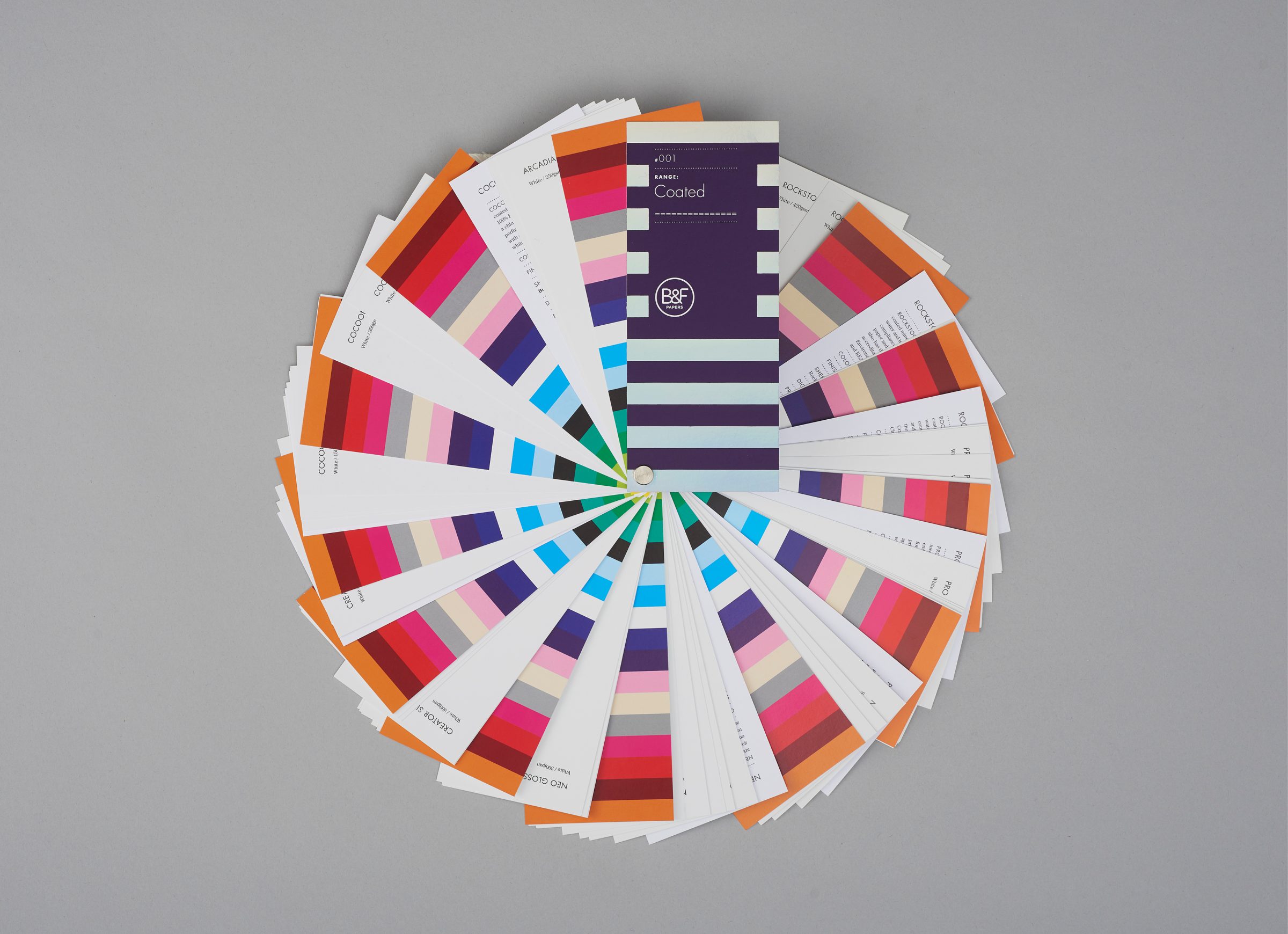
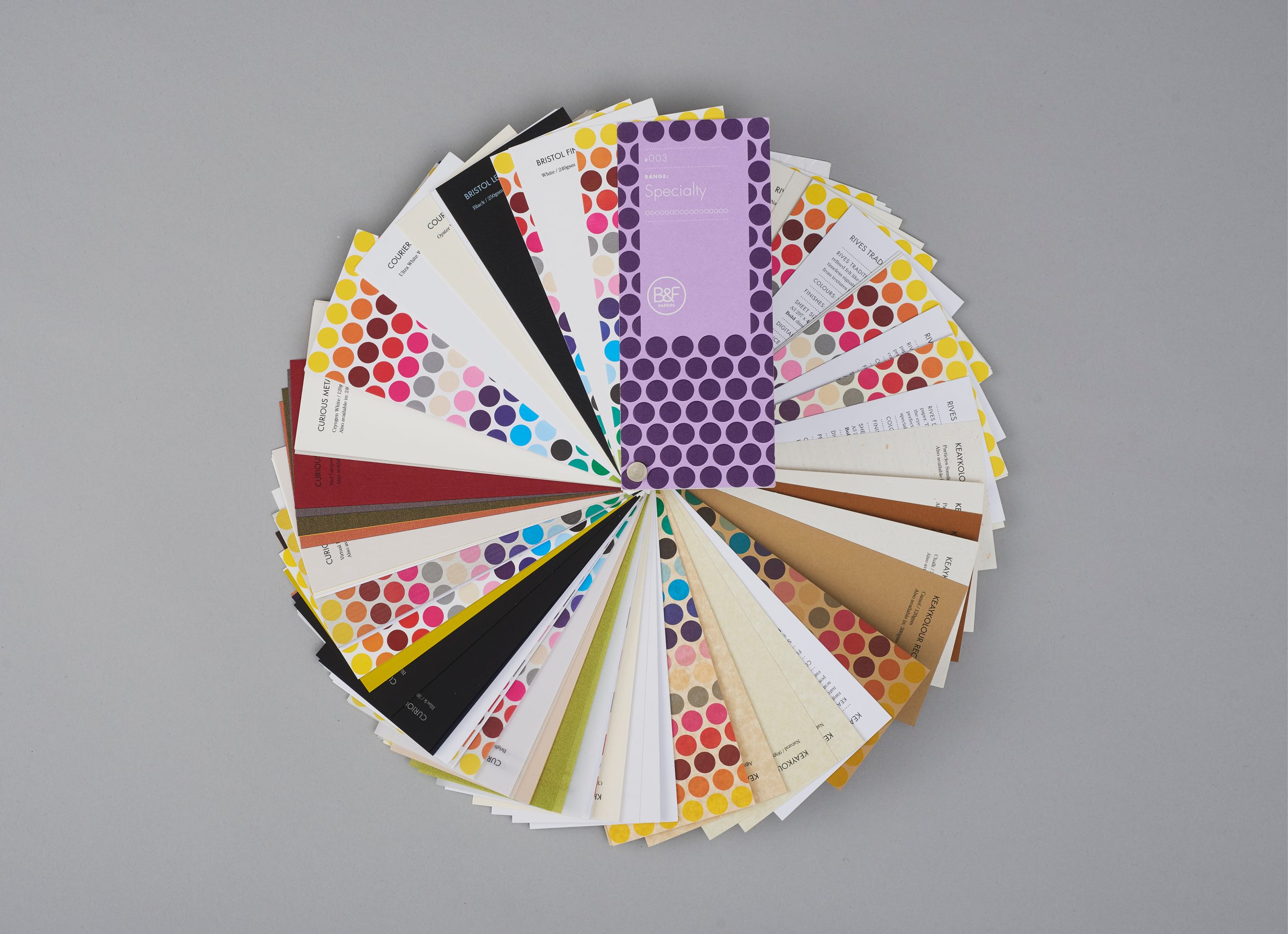
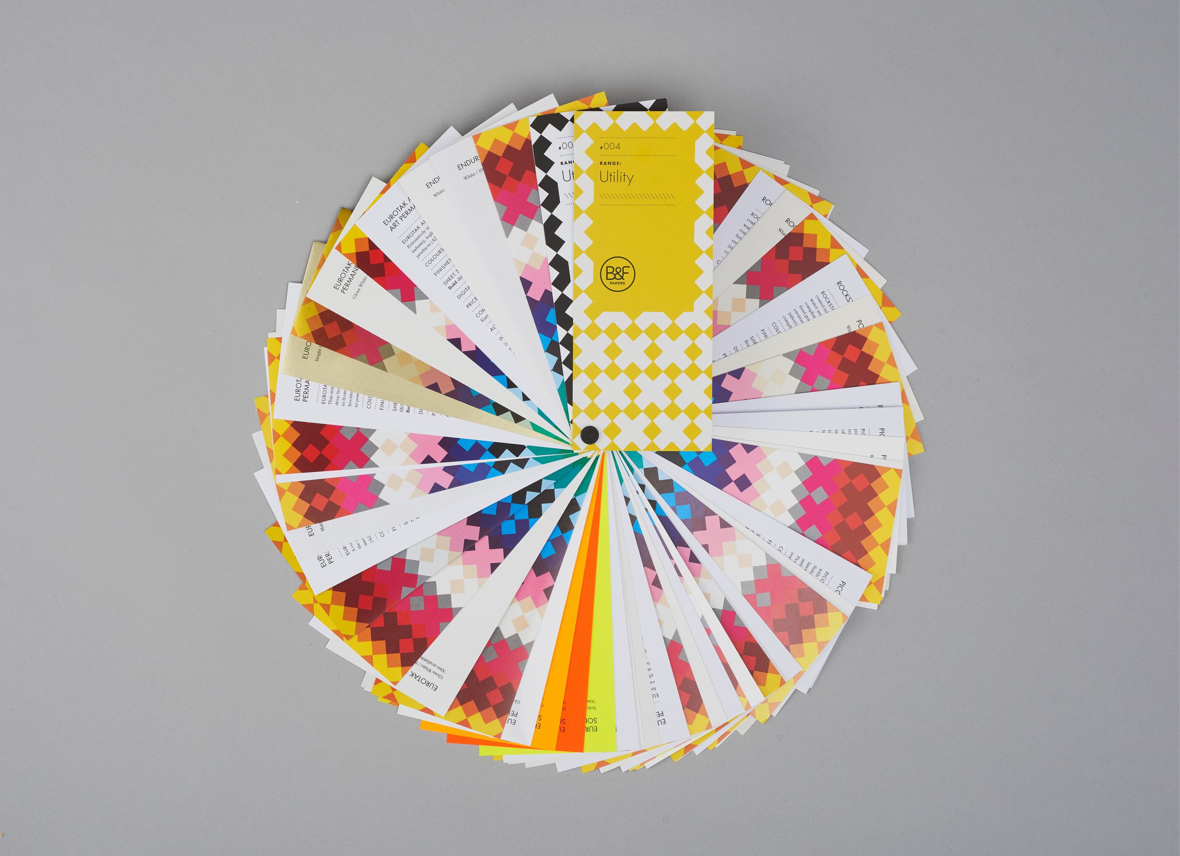
So we concentrated on colour. A consistently printed step-change colour range clearly shows how each paper performs, making it easy to compare different paper qualities quickly — across all ranges. And we made it a decent size.
Each book is differentiated with a geometric pattern — same colours, different pattern. A print-finish accent & the cover colour further amplifies the stock category:
— Utility is kiss-cut, bright-yellow printed sticker stock bonded to board.
— Packaging is screen printed white on a heavy boxboard.
— Uncoated, the designers go-to, had to be black with black foil.
— Specialty is glitzy purple & lilac embossed & printed on glitter stock {so special ;)}.
— Coated is rainbow foiled on high-gloss card.
They also look good littering the studio — an unfair competitive advantage that seems to be working in B&F’s favour…