TANA MITCHELL
https://tanamitchell.com/wp-content/uploads/2020/01/Ripe-2000-x-1450-px-1-2400x1740.jpg https://tanamitchell.com/wp-content/uploads/2020/01/Ripe-2000-x-1450-px2-3-2400x1740.jpg https://tanamitchell.com/wp-content/uploads/2020/01/Ripe-2000-x-1450-px3-3-2400x1740.jpg https://tanamitchell.com/wp-content/uploads/2020/01/Ripe-2000-x-1450-px4-3-2400x1740.jpg https://tanamitchell.com/wp-content/uploads/2020/01/Ripe-2000-x-1450-px5-4-2400x1740.jpg https://tanamitchell.com/wp-content/uploads/2020/01/Ripe-2000-x-1450-px6-3-2400x1740.jpg https://tanamitchell.com/wp-content/uploads/2020/01/Ripe-2000-x-1450-px7-4-2400x1740.jpg https://tanamitchell.com/wp-content/uploads/2020/01/Ripe-2000-x-1450-px8-2-2400x1740.jpg https://tanamitchell.com/wp-content/uploads/2020/01/Ripe-2000-x-1450-px9-2-2400x1740.jpg https://tanamitchell.com/wp-content/uploads/2020/01/Ripe-2000-x-1450-px10-2-2400x1740.jpg
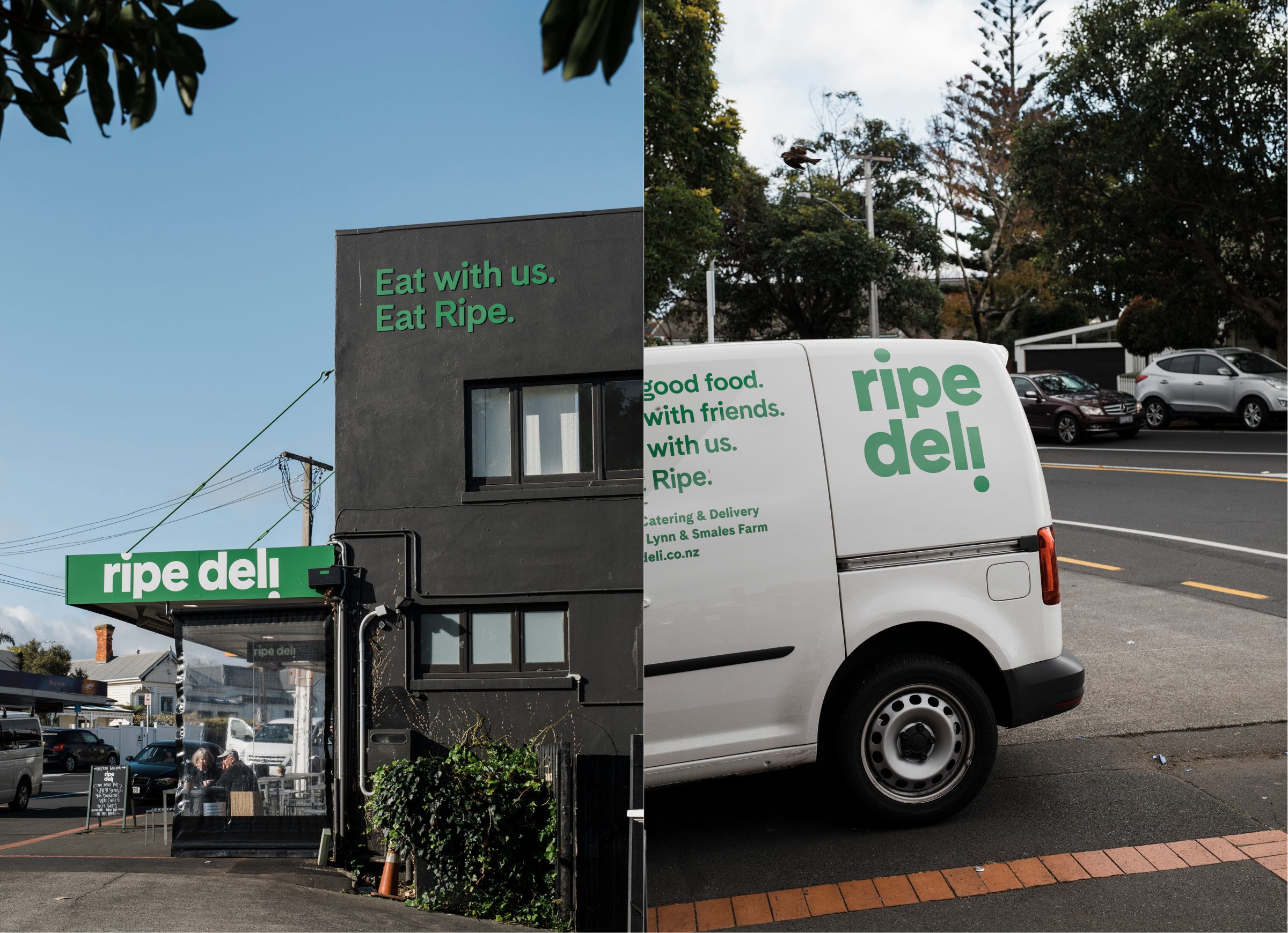
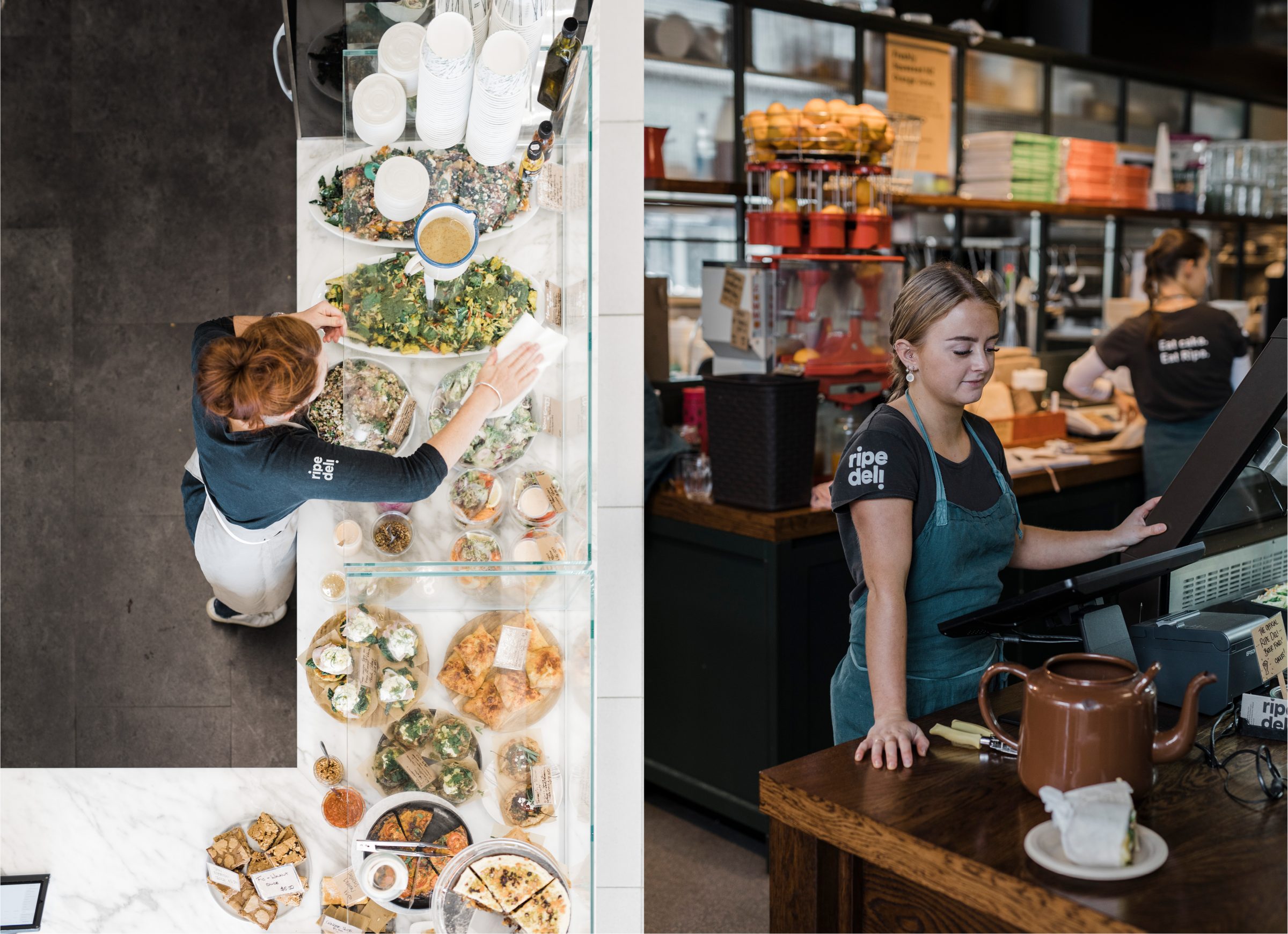
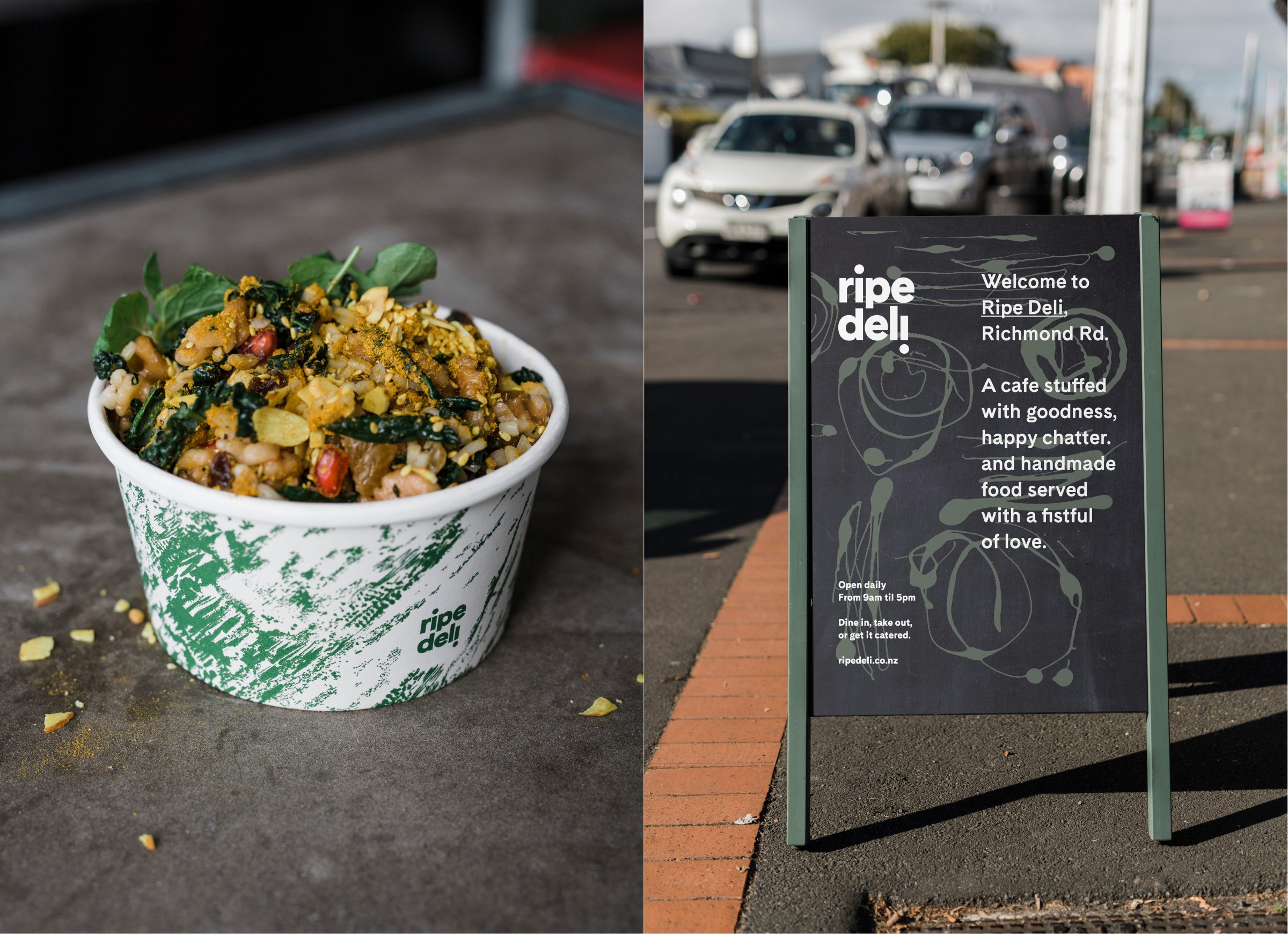
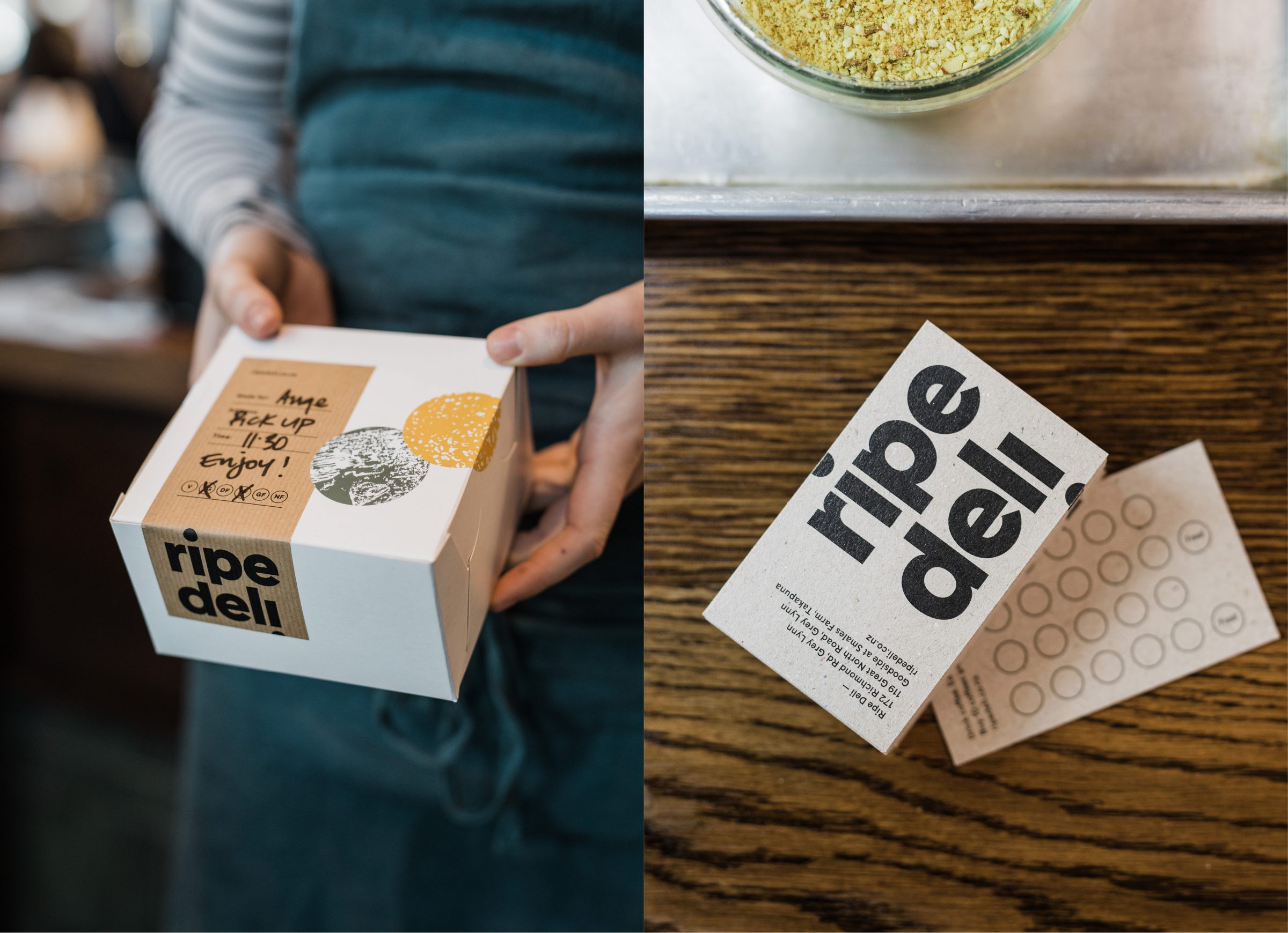
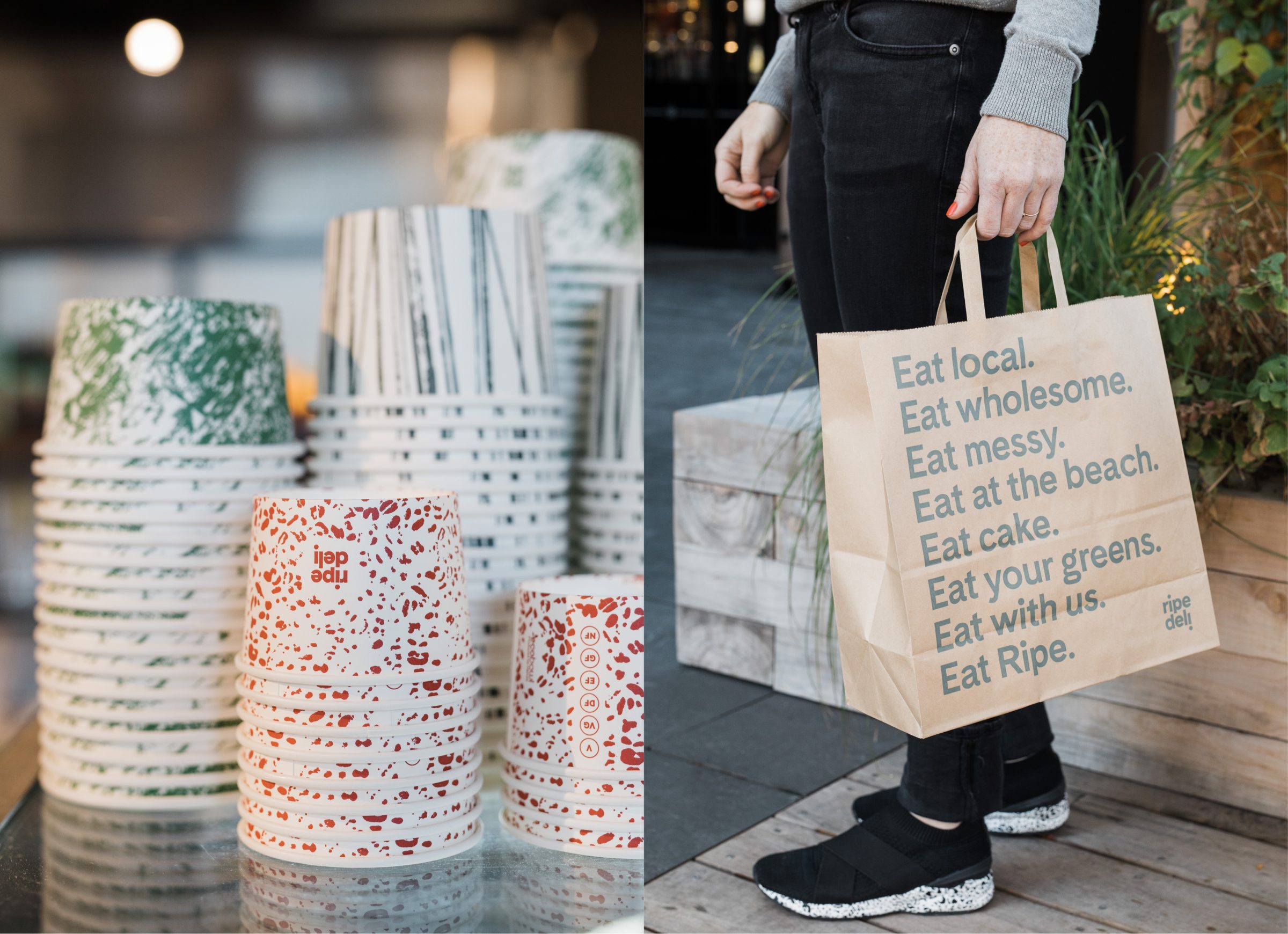
Ripe Deli is a Grey Lynn institution, loved and trusted since the 90s. They make rustic, wholesome 100% homemade eats and treats that are robustly healthy, super yum and ready-to-go. After 20 years they found themselves lost amongst me-too competition, and used the recent expansion from one cafe to three to refresh their branding.
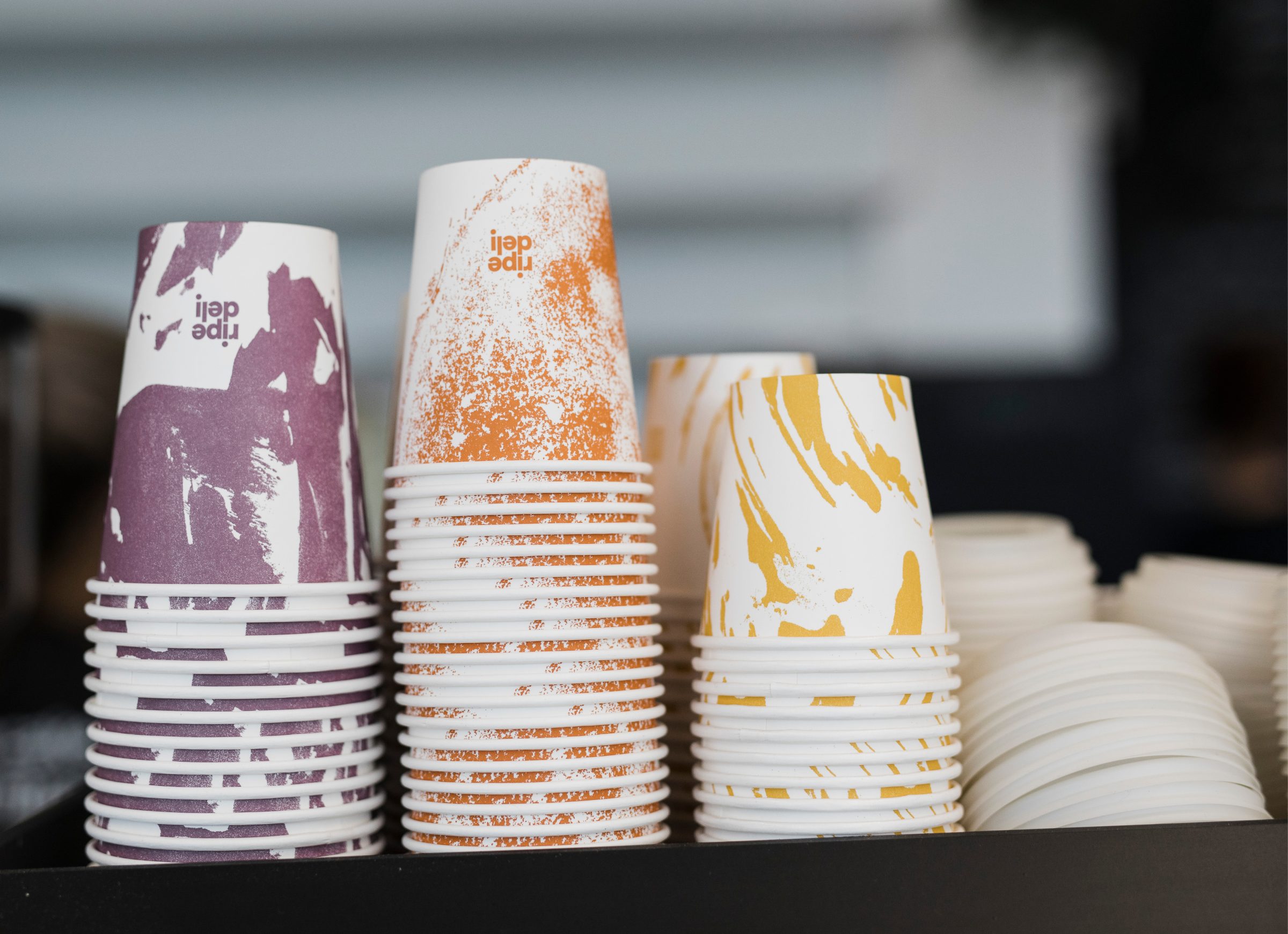
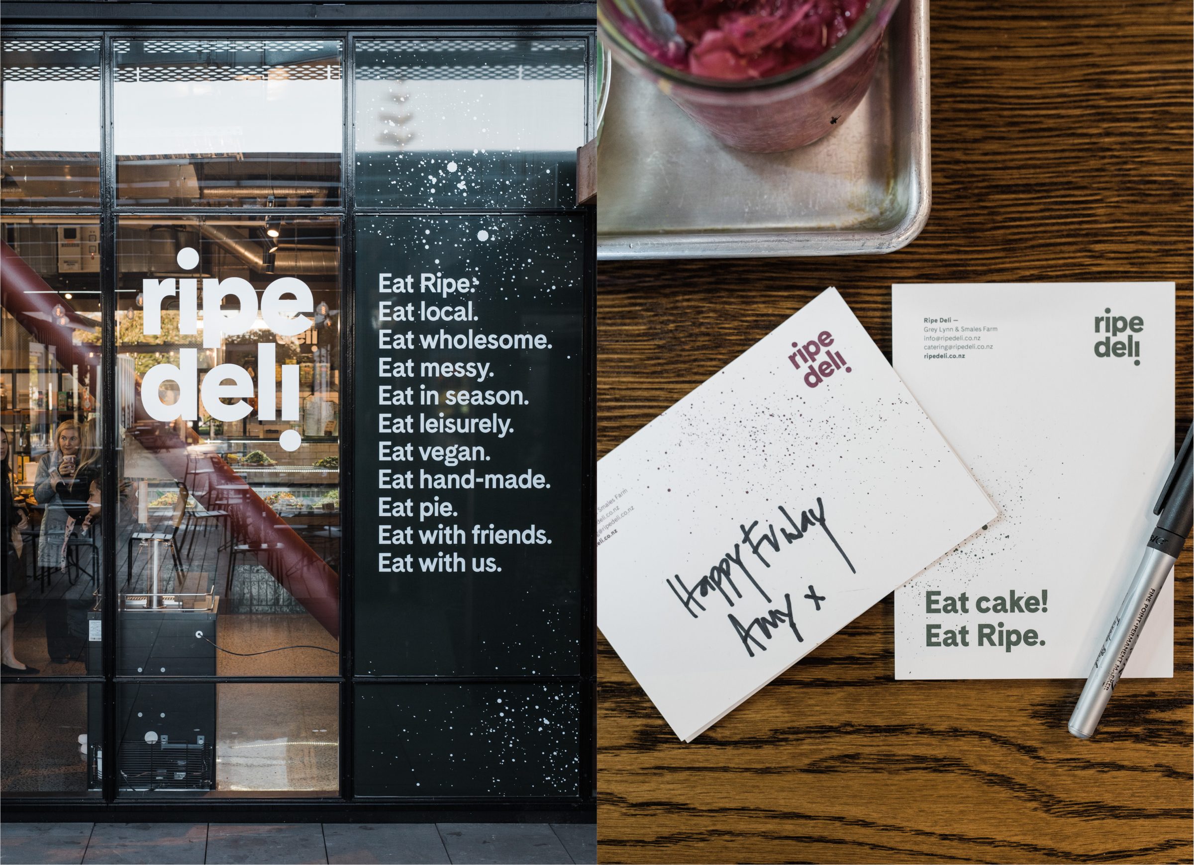
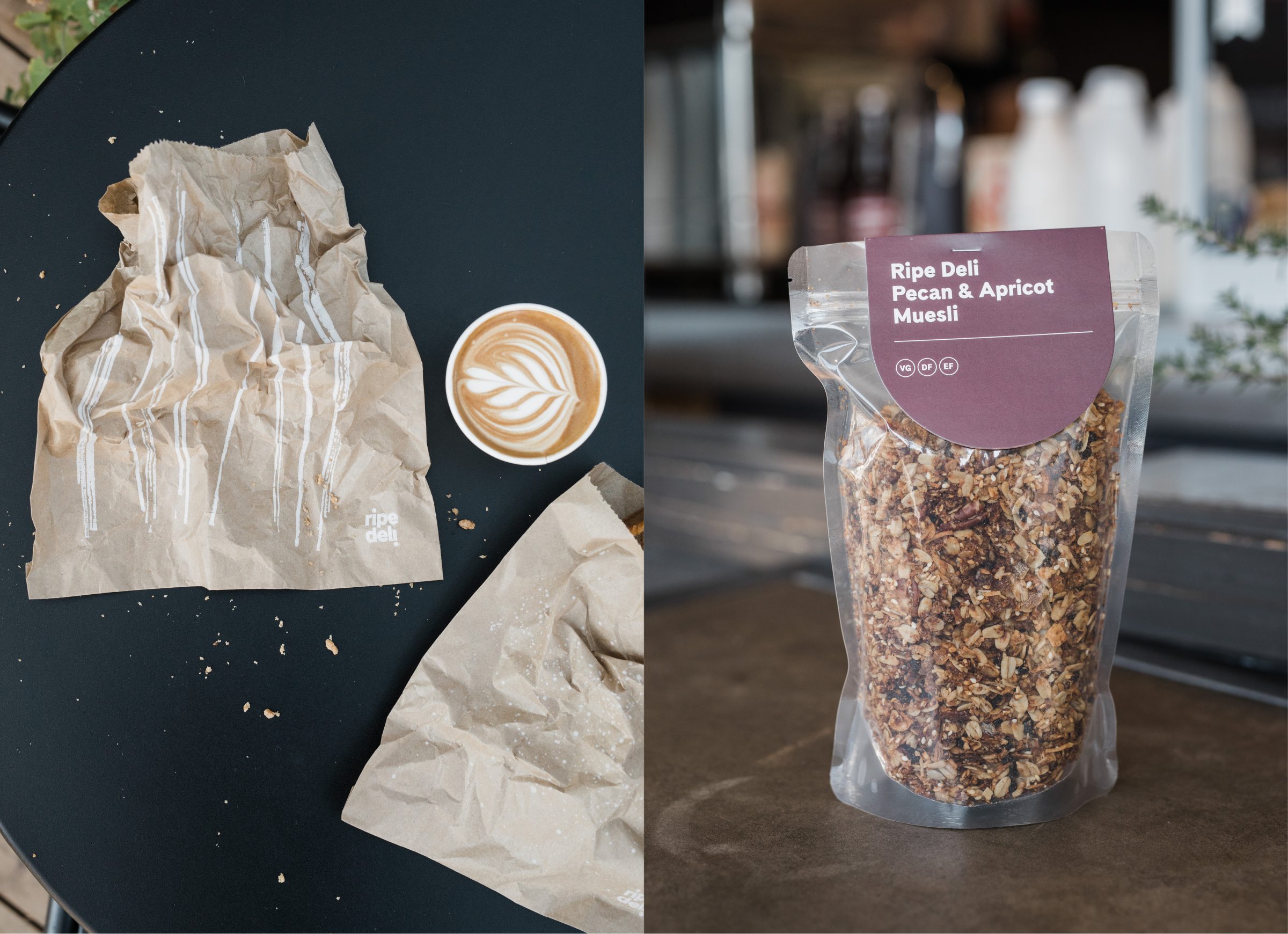
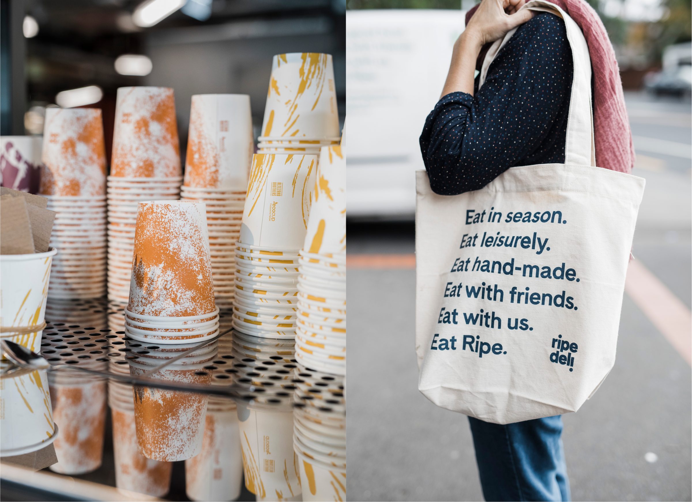
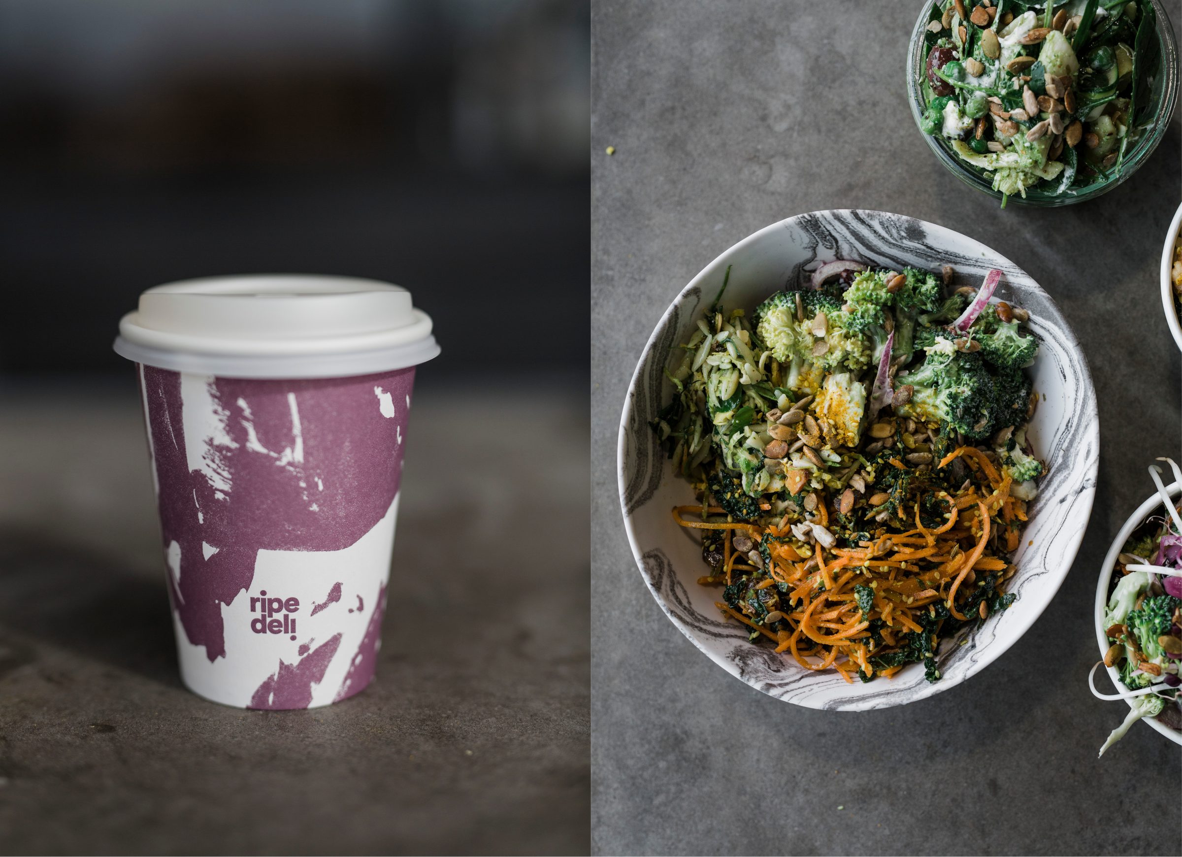
Ripe have been throwing it together perfectly for years.  So we encouraged them to keep doing that, but this time with ink and paper.  The resulting prints are applied across fitouts, packaging and collateral, in a series of mix’n’match textures that have become ingredients of the brand. And just like their cooking style, the result is intuitive, unfussy layouts — paired with strong and simple typography to balance the flavour.